Five Years of Cut Me Up Magazine
Symposium at Kolaj Fest, New Orleans 2023
Five Years of Cut Me Up Magazine
Symposium at Kolaj Fest, New Orleans 2023
June 10, 2023
Kolaj Website: Cut Me Up: Fifth Anniversary
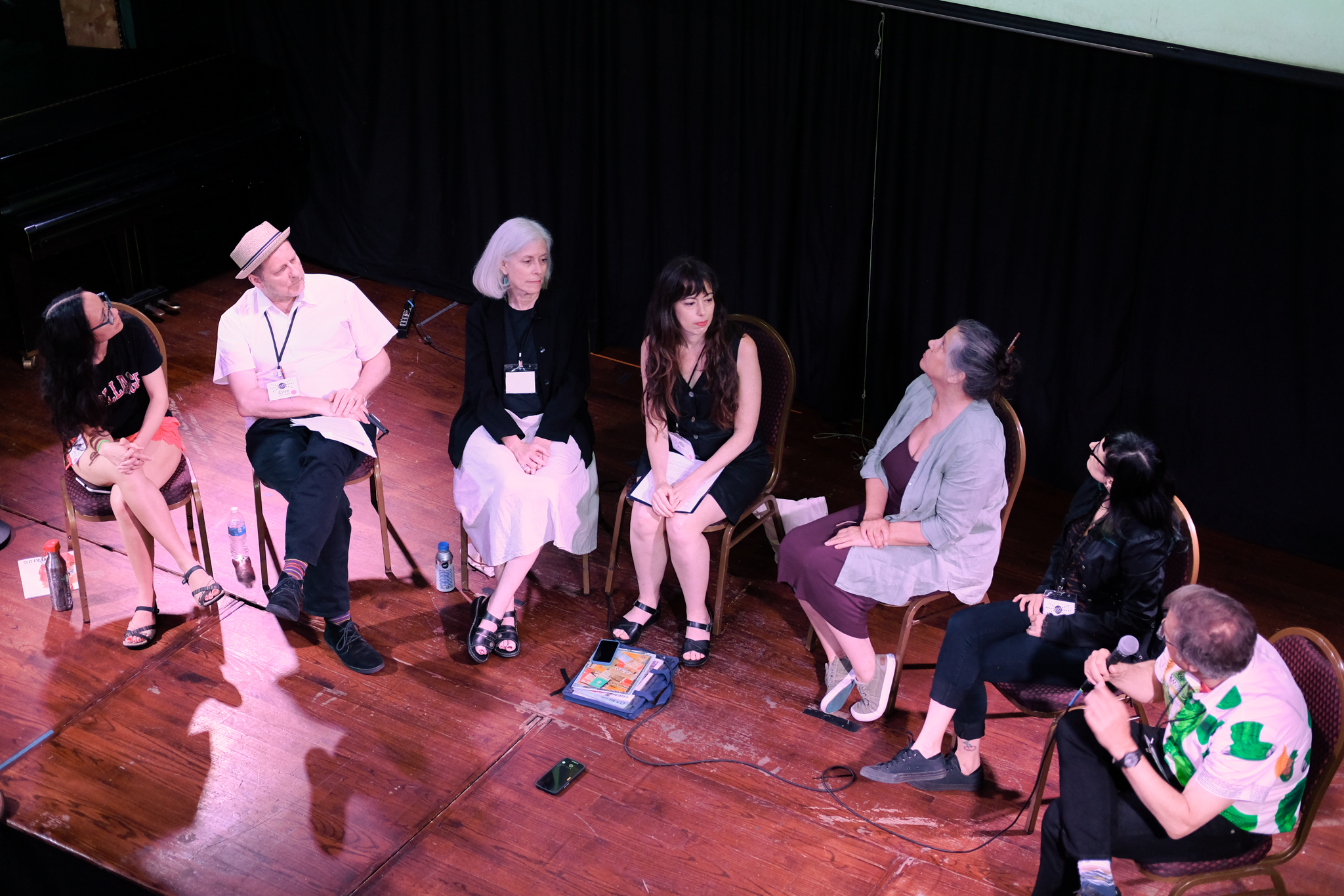
To celebrate the 5th anniversary of Cut Me Up Magazine, Andrea Burgay hosted a panel of artists and curators who have been a part of Cut Me Up over the last 5 years at Kolaj Fest New Orleans. Cut Me Up was first released at Kolaj Fest in 2018, so it was a perfect venue to return to for this event.
Cheryl Chudyk, Clive Knights, Janice McDonald, and Rosanne Walsh discussed how they’ve adapted their own artistic processes to respond to Cut Me Up calls and the artwork of others in their published works. Naomi White, curator of Issue 8: Guided by Instinct, and Michael Oatman, curator of Issue 6: Object Lessons, shared insights into the curatorial processes for these issues, from developing a call, to selecting artwork, to how they see the trajectory of the magazine developing over time.
Andrea Burgay
Cut Me Up Editor and Founder
“I’m often asked what led me to start this magazine. Several ideas that are very important to my own work with collage led to the creation of Cut Me Up, including the power of transformation as a way to respond to an object or material and give it new meaning; connecting with rhythms of the cycles of life—death, decay and rebirth; questions of inspiration and ownership: If a piece is literally made of fragments of other people’s work, can it fully be claimed as one’s own?; and a desire to expand how we think about collage methods and materials.
“But above all, Cut Me Up arose from my jealousy of musicians, specifically the unspoken dialogue created by different instruments or vocals played in response to each other, known as call and response.
“I was always drawn to visual arts, but many people in my family are musicians, and after many family events, they would “jam”—take out the guitars, and without any set plan, just sit down and play. Someone would play rhythm, and someone else would start playing a riff, then a solo, and then someone else would jump in and take it in an entirely new direction.
“Visual artists don’t have a common structure in which to interact like this. We look at each other’s work, and for the most part, use words or writing to describe what we think about it. I wanted to create a new scenario in which artists could respond to each other’s work visually, in the language we know best.
“Musical call and response also extends into performance. The audience knows the words, sings along, and sometimes the band stops entirely, letting the audience lead. This dissolves the boundary between performers and audience, making everyone both a participant and a creator. This is also what I wanted to create with Cut Me Up—a magazine where the readers become the creators of the next content and the artists even become curators of future issues. A visual symphony where we are all mixed in together.”
Read Andrea Burgay’s full panel intro here.
View more of Andrea Burgay’s work:
andreaburgay.com / @andreaburgay
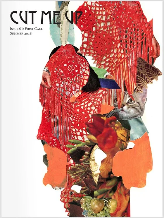
Cut Me Up Issue 1: First Call, art and cover by Andrea Burgay
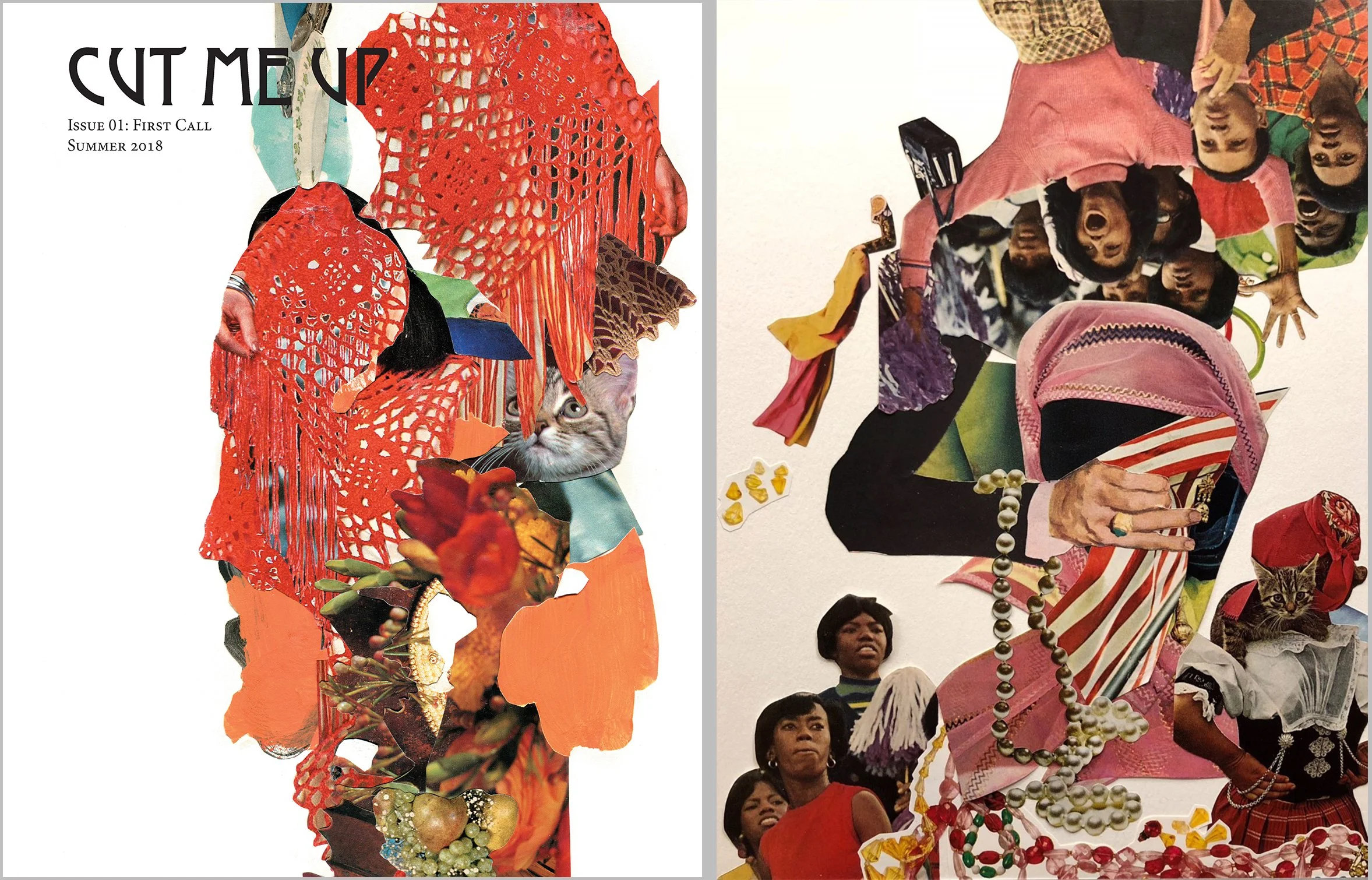
Left: Andrea Burgay, Untitled 01, Cut Me Up Issue 1: First Call
Right: Cheryl Chudyk, Because He Was Very Inebriated, Cut Me Up Issue 2: Inside Out
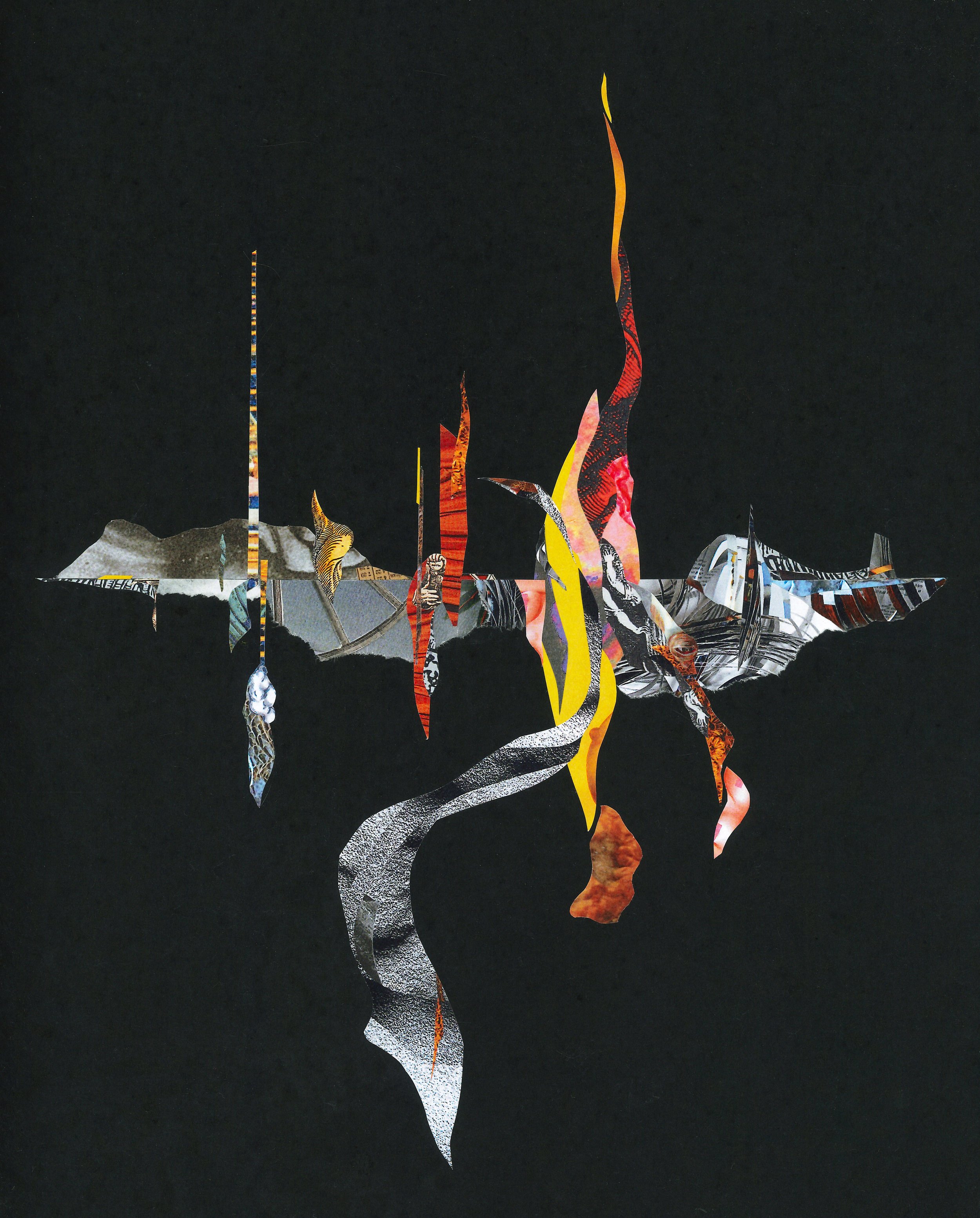
Left: Keith Childress, Lair of the Uncanny, Cut Me Up Issue 2: Inside Out
Right: Cheryl Chudyk, Spectators, Cut Me Up issue 3: Tabula Rasa
Cheryl Chudyk
Cut Me Up Published Artist
“Cut Me Up was the first submission I had ever made to a publication, and since then I’ve had work published 17 times, and counting. Collaborative work and the collage community is a huge part of my art practice, and Cut Me Up was one of two formative instigators in developing this.
“It was interesting to flip through what's left of my issues and see how many works have one hand or two hands in them - motioning, or reaching, grasping, and even often “jazz hands” for lack of a better word. It's fun to see images from Issue 1 and 2 still appearing in the newest issues, like little easter eggs that only certain artists would be privy to notice.
“I think for many of the submissions, especially the early issues, my approach was more of an ekphrastic response, versus cutting up and incorporating the actual images. My issue two submission echoed the cover of issue one in layout and the heavy use of warm colors, fabrics, jewels, or fruit/buds, with more emphasis on a large hand across the middle versus the part of a hand in the upper left of issue one's cover. And of course the cat. I remember for the first one, I only used one small piece from the cover because I didn't have the heart to destroy the magazine. I flipped through it now and I did cut out one other small section of another page but didn't use it.
“For Issue three in the top right quadrant, I was echoing the bottom right quadrant of Keith Childress's Lair of the Uncanny.
“I pulled together many of my submissions to see them as a whole and it's interesting to see it's either lots of white negative space, or maximalist collage (or at least maximalist for me). Reading back through the wording of the actual calls I'm reminded how incredibly difficult many of them were and how I wrestled with them issue after issue—use only contemporary (!) sources; a vertical (!) landscape involving whiteness (!); I didn't even remotely have any material that would fit Kike's call; express a relationship with animals without (!) relying on animal imagery; a self-portrait without (!) facial features or anatomy—these parameters became like problems to solve. Often it was a way show (an idea) without relying on the expected crutches.”
Cheryl Chudyk is a Canadian artist with a background in wedding photography, ballet, jazz and contemporary dance, and dabbles in painting, poetry and comics. She co-founded and co-curates Sharp Hands Gallery and is always looking to make collaborative pieces with other artists.
View more of Cheryl Chudyk’s work:
@stitchpixie
Clive Knights
Cut Me Up Published Artist
“My contributions to Cut Me Up over the years have always been closely tied to the collage experiments I am working through in my studio at the time. So, they each have become, whether published or not, an intriguing snapshot of the inspirations and obsessions in my practice over the last five years.
“Early on I was exploring 'light-ray excavations' that exploit the translucency of papers and the unanticipated intermingling of images; later I had just completed the Fencework Gallery at my home and it became the infrastructure of a 3-dimensional submission comprising elements wrapped in every page of the source issue; two years ago I began making the collage series 'autochthonous cities' and so a submission was born specifically from the visual nutrients of a Cut Me Up magazine, again using a fragment from every single page in the source issue, exercising an egalitarian sensibility by aiming to render a greater sense of communal participation in the outcome of my work.
“All collage borrows, gathers, re-tells the familiar stories already implied in found images in new and unfamiliar ways. Cut Me Up magazine distills this spirit of collage into the institution of the print periodical, thus foregrounding the act of borrowing, legitimizing it and celebrating it as a collage-makers prerogative.”
Clive Knights is an Englishman living in the western United States and his background is in architectural design, history and theory. He has taught architecture for 39 years and incorporated collage as a mainstay of his pedagogy throughout. Clive has exhibited his collages and monotype prints internationally in many group shows and is currently represented in the USA by Laura Vincent Design and Gallery, Portland, Oregon, with whom he has had 2 recent solo exhibitions (2021, 2022). He also writes on collage, transcendent space and the human creative impulse.
View more of Clive Knight’s work:
cliveknights.com / @knightsclive
Clive Knights, Putucem, Cut Me Up issue 8: Guided by Instinct
Janice McDonald, Facts Matter: Sources/Proof of Provenance, Cut Me Up Issue 4: Turning Point
Janice McDonald, Metaphor, Cut Me Up Issue 9: Scars and All
Janice McDonald
Cut Me Up Published Artist
“Cut Me Up: Issue 1 came into my possession during the first KolajFest. I rarely work collaboratively but this seemed like the kind of collaboration that I would be interested in and make time for. Responding to a call seemed kind of like working with a design brief, something I’ve always enjoyed. And I loved the concept of sharing materials.
“The call for Issue 4 asked us to use clippings sourced from periodicals published in 2019. This was problematic for me as I rip things out all the time and toss them into bins to use eventually, but usually don’t recall when or where they were sourced. I decided it would be interesting to only use pieces from the previous issue and elements that I found that included a 2019 date, so they were mostly from the covers of catalogs and magazines. This approach seemed especially appropriate as proof in the age of Trump and “alternative facts.” I wanted to include the attribution of dates but hardly ever include words in my collages so this was a good challenge and created an interesting parameter to work within. It’s called Facts Matter: Sources/Proof of Provenance.
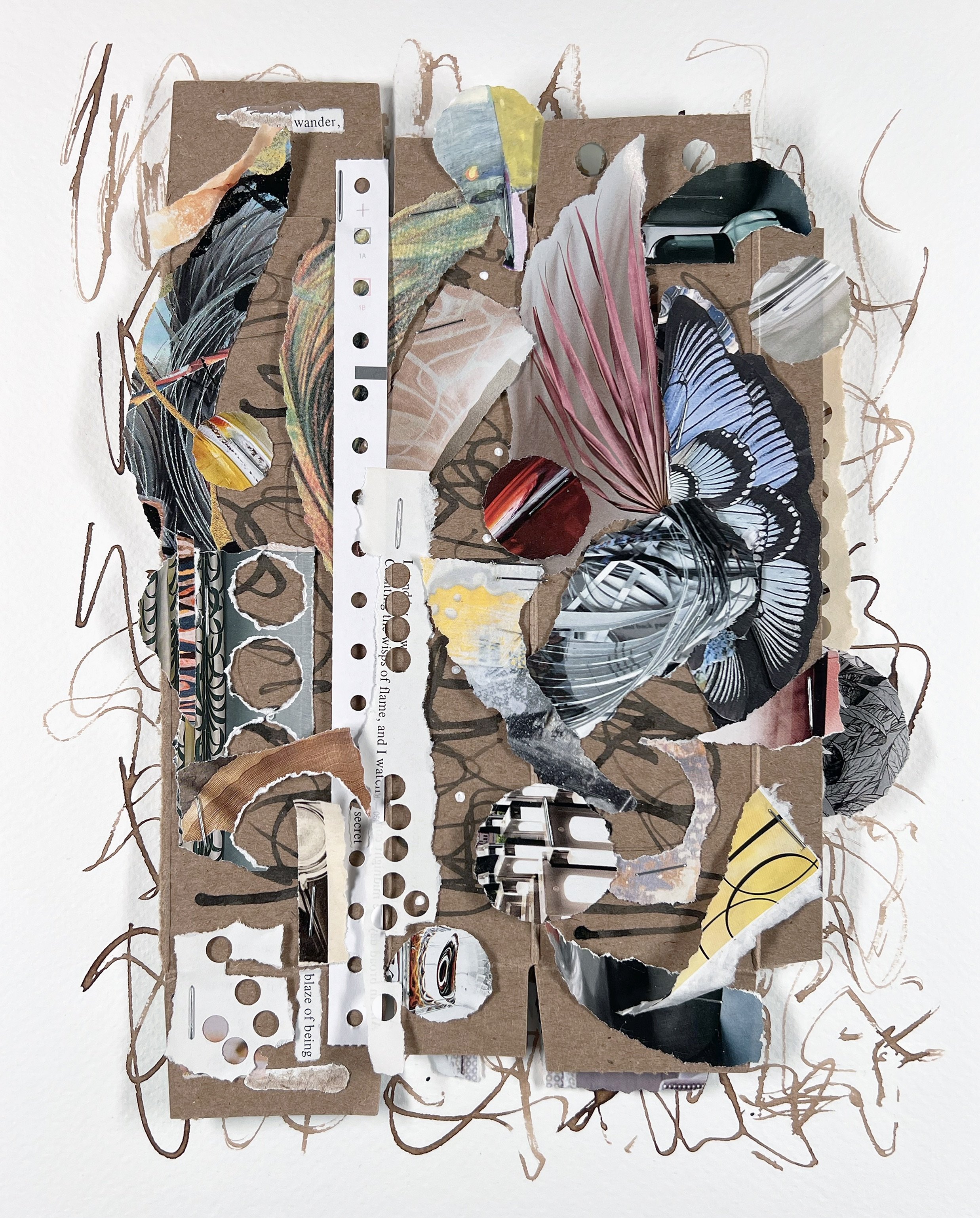
“My entry for Issue 9: Scars and All was put together with staples, as the fastening device needed to be evident. I had been experimenting with some asemic writing so I used a page of that as the support which created a kind of organic and dynamic framing within which all kinds of layering was assembled. I attempted to get the motion within the added paper elements to connect and relate to the pen strokes. The piece alludes to lots of things that I’m currently interested in exploring. The result was more frenetic than most of my work but seemed to reflect how life often feels to me, with my brain going in lots of directions and me just barely keeping things together — a pretty apt "psychological self-portrait” that I titled Metaphor.
“One of the things that I’ve enjoyed about working on submissions for Cut Me Up are that they are often a diversion from the series of collages I may be working on in the studio. I like having the long period of time between receiving the call issue and the deadline to let ideas percolate and improve as I think about them. It has been rewarding to approach and work on concepts that I would not normally come up with for myself. The magazine feels like a safe space to really experiment. I’m thrilled to have had my work selected for publication and it’s been a joy to see what other artists come up with, as well as to see how snippets of my pieces are re-used and re-appear over time.”
Janice McDonald is an artist whose works find homes with individual collectors, in site-specific commissions, and in corporate collections. Based in Colorado, she exhibits widely and has sustained a daily collage practice for over five years. Janice loves working with torn elements of color and texture, making subtle connections, and attempting to create a dynamic balance between disparate forms and ideas.
View more of Janice’s McDonald’s work:
janicemcdonald.com / @janicemcdonaldart
Rosanne Walsh
Cut Me Up Published Artist
“Participating in Cut Me Up, with its very specific, yet broadly interpretive prompts, helped me to focus my practice, by encouraging me to more deeply navigate thoughts I may not have considered, through the act of organizing materials.
“Of the four prompts I’ve worked on, Laurent Seljan’s Scars and All (Issue 9), compelled me the most, due to its dual requirements. This call was to create a psychological self-portrait, without physical likeness, that dares to bare the parts of yourself that you consider to be a weakness. Additionally, and more daunting, we were to use an attachment method other than glue as an integral element in the piece. Of the various attachment methods I imagined, sewing was the most familiar. I had grown up wearing dresses sewn by my mother, and had sewn clothing and toys for my own children. Also, the more I thought about the title of the call, Scars and All, I thought of a scar as a wound that had been stitched closed.
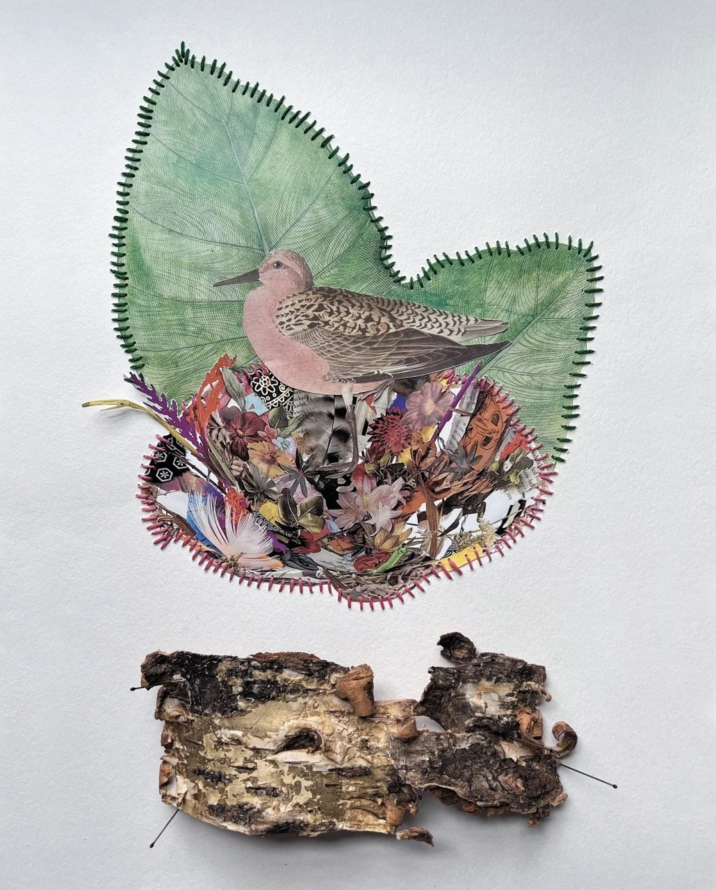
“From Issue 8: Guided by Instinct, I connected most strongly to Iain Machell’s Little Wing and Rosie Schinner’s Nest, two bird-related works. On several occasions, mother birds have woven nests just outside my studio windows, and raised chicks under my fascinated eye. Witnessing the actions of the mother bird, I felt a deep connection to her as another mother. In my own experience, there is an indescribable knowing that happens in every cell of the nurturing mother, that becomes central to her existence and guides every thought, feeling, and action. The all-consuming focus and activity of the mother bird felt familiar to my own experience. The decision to sew, combined with bird imagery, led me to create my self-portrait as a mother bird. The piece came together easily, and was “very nice.” In fact, its “very niceness” felt a bit foolish, much like a bird feathering an empty nest. I looked around at my makeshift studio in the guest room, which was filled with all my adult childrens’ old toys and books, and felt the full-on ridiculousness of it all. I had given the ghosts of their childhood more space in my house than I gave myself. As an artist, my “scar” is my habit of not letting go of something I like in a work, even when I can see that it isn't helping the piece forward. I was embarrassed by the Hallmark quality of my piece- the prettiness and constraint expressed everything I tried so hard to be as a mother, but failed as an expression of myself as an artist. I wanted to be free and loose and wild in my art, not safe. Time to try again.
“Sifting through my piles of papers, I pulled out an old, unfinished watercolor, which I had begun in a moment of relaxed creativity, and decided to use it as a playful beginning. Going through Issue 8 again, I paused on The Carnivore's Dilemma, by Laurent Selgan. I loved the movement of the figure, turning her back on her own bad decisions, but it was the easy elegance of the color relations bracketing the focal point that seemed to force a startled stop that created the tension. I wanted that tension and ease in my work, and decided to keep his whole outer composition in my piece. Placing my watercolor right on top felt impetuous, and slightly naughty, in a good way. I wanted more. On the very next page was Dando’s Dogs, by Scott Neff, a very naughty boy, indeed, as evidenced by his rebellious rule breaking. Had we not specifically been forbidden from including images of animals in the Instinct challenge? Tsk tsk…. But I loved it. Everything about it was a wild ride, neatly contained in the rusty palette of the 70’s. Scott clearly had fun making this mysterious and disconcerting collage, about an alcoholic priest being sucked into hell, with his poor dogs following suit. In celebration of Scott’s bad-assery, I cut out a dog, releasing it from its intended destination. Dogs can’t go to Hell, for they are pure and loving representatives of the earthly kingdom. This bounding hound deserved another shot at life, without Dando. Released from its role as Dando’s guard, the hound could go on, like I could, without the sanctified role of motherhood. I could let go of making everything all nice-nice, and be a bad-ass, like Scott! I reincarnated myself as a playful spirit, bounding into space in the body of a dog. Pins served to hold it together, however briefly, allowing for CHANGE.”
Rosanne Walsh is a graduate of the Rhode Island School of Design, who worked in the Film in-dustry prior to becoming a public school art educator for many years. Comfortable with several mediums, and with stretching a budget, she prefers to work as a mixed me-dia collage and assemblage artist, feeling a connection to the nuances of objects and materials and the subsequent language conveyed upon combination. Whether painted paper, discarded candy wrappers, old frying pans or hangers, she introduces pieces until an instinctual understanding is felt that guides the rest of the work through experimentation.
View more of Rosanne Walsh’s work:
rosannewalsh.com / @rosannewalshart
Left: Iain Machell, Little Wing
Right: Rosie Schinners, Nest
Both from Cut Me Up Issue 8: Guided by Instinct
Rosanne Walsh, Feathering the Empty Nest, Cut Me Up Issue 9: Scars and All
Left: Laurent Seljan, The Omnivore’s Dilemma
Right: Scott Neff, Dando’s Dogs
Both from Cut Me Up Issue 8: Guided by Instinct
Rosanne Walsh, Frolicking Incarnations, Cut Me Up Issue 9: Scars and All
Cut Me Up Issue 6: Object Lessons, curated by Michael Oatman, cover art Yura Adams
Michael Oatman
Guest Curator
Issue 6: Object Lessons
“Like you, I'm a collage-aholic. It's been 40 years since I picked up my first number 11 X-ccto blade.
“I'm curious how many of you have been working in your studio and suddenly you see a full body of work sort of emerge in your brain, and you know where that's going to go? Some of you are nodding.
“That's what it was like when I encountered Cut Me Up Magazine. It's rare that you can see the future in someone else's work, but that was my experience. When I met Andrea and saw the magazine, I kind of understood immediately how it was going to unfold. Not exactly in what order, but that became for me the kind of philosophical construct of how I would put the thing together and come up with my thematic call. I'm just about to start my 40th year teaching, and so pedagogy is something that really is foregrounded now, even in my heart, so it is the approach that I leaned on for this call.
“We had some great early conversations. When you decide that your mission is to help the magazine evolve in a particular way, there's a bunch of options that are very exciting in terms of what you would like to see, what you'd like to get back from the call. I decided that it was really important to be very selective about where the next call would lead, not (only) for that issue, but for the ripple 10 or 20 issues later.
“Some early ideas that I had were a sound issue where artists would make collages that were really influenced by music. That was a strong contender. Another one was to think about the history and influence of the frame—sequential art, film, and comic books—the idea of this delimiter around the Renaissance perspective of the world, and then you hit the edge of the world. In other words, the nature of the envelope. That was another serious thing. But in the end, it became about working three dimensionally.
“I really admire the thematic issues that have come out that have been about certain subjects like alchemy and the relationship we have with animals, but even with that interest in subject matter, I thought, let's just try to drive it into a dimensional shift. This was a really interesting opportunity to do something with the space of the surface of the magazine. I love that (Yura Adam’s cover piece) was shot outside her studio porch looking out into the world. That was part of the prompt—consider how you represent the image? What's the nature of the scene in which it occurs? Is it that kind of “product shot” in an airless world or does it include the real world? So I thought I'd just share with you very briefly my thoughts about how to put an issue together that would have this ripple effect later on.“
Michael Oatman lives in Troy, New York where he teaches in the School of Architecture at Rensselaer Polytechnic Institute. His large-scale installations and collages have been exhibited internationally and take inspiration from the geopolitical landscape of his Vermont childhood, 19th & 20th century industrial folklore, mainstream cinema and experimental filmmaking. Ongoing themes include eugenics, institu-tional collections, paradigm shifts in scientific inquiry and the exploration of space. Oatman is the 2003 recipient of the Nancy Graves Foundation Award, and is the first artist invited to work with the archives of Apollo 11 Astro-naut Neil Armstrong.
More about Cut Me Up Issue 6: Object Lessons here.
View more of Michael Oatman’s work:
Michael Oatman / @michaeloatmanartist
Naomi White
Guest Curator
Issue 8: Guided by Instinct
“Collage was the perfect medium for getting in touch with our feelings and concerns about animals as they become more invisible in our daily lives. Artists were asked to explore how they’ve been affected by animals, the roles they play in our lives, and confront the awareness that images may be all we have left of them soon.
“The issue before mine focused on alchemy, magic, and cycles of life, which is how humans have related to animals throughout history and into the present, which made a beautiful bridge between these ideas.
“Animals are magical creatures who guide and inspire us, nurture and sooth us. Animals in mythology, the occult, in religion, are mortal and immortal, reflecting an existential dualism, which is seen in the treatment of animals. The farmer rears animals, feeds and loves them, plays with them, nurtures them, then kills and eats them. This is not done with malice or guilt, but an energy exchange and with a full valuation of the animal’s life.
“All kinds of creatures, from fierce leopards to tiny spiders, play important roles in mythology and origins stories. Animals are often used to explain the world. The first subject matter for painting was an animal, and it was probably painted with animal blood.”
Naomi White is an abolitionist feminist, artist and educator, working on ideas at the intersection of political ecology and photography. Throughout her work, White addresses an array of complex contemporary issues, questioning dominant ethics and narratives throughout history, and asking how we can shift our focus away from the current racist, capitalist model of domination to one of equity and collective voice, for the sake of all people, animals and the planet.
More about Cut Me Up Issue 8: Guided by Instinct here.
View more of Naomi’s White’s work:
naomiwhite.co / @naomiwhitevisualartist
Cut Me Up Issue 8: Guided by Instinct, curated by Naomi White, cover art by Suné Woods
Cut Me Up: Transitions
Kolaj Fest, New Orleans 2023
June 7-11 2023
Artworks from each issue of Cut Me Up Magazine are transformed by artists to create submissions for the next issue in response to curatorial calls addressing specific contemporary themes and collage methods. On view at Kolaj Fest, New Orleans is an exhibition of these Cut Me Up "Transitions" showing works transformed from issue-to-issue in response to each curatorial call.
Participating artists (listed from left to right, top to bottom): Andrea Burgay, Jess Costanzo, Luciana Frigerio, Joyce Hill, Olivia Browne, Cless, Iain Machell, Janet Gold, Gregory Malphurs

